The Backstory
When my folks moved out to LA from Indonesia, they rooted themselves firmly in the West side. Though we moved around a lot, we always found ourselves coming back to Sawtelle. Over the years, this area has grown into a massive hub for friends, family, and foodies, going as far as to earn the Japantown title in 2015.
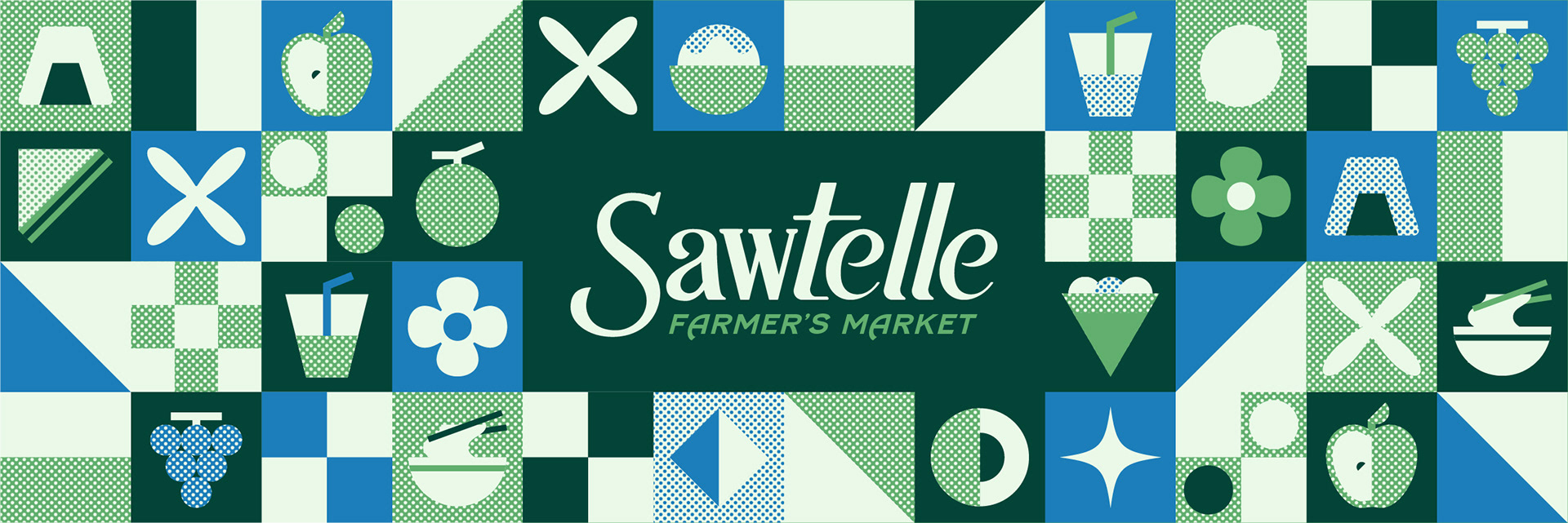
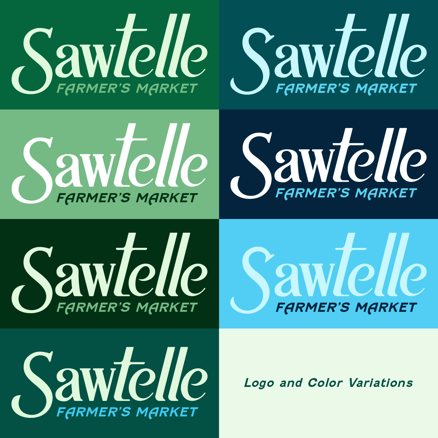
With such a love for this area, a farmer's market held bi-weekly would be a fun addition to anybody's weekend! The simple icons featured in the branding are foods commonly found in Sawtelle and a traditional farmer's market, sure to remind you instantly of your favorite foods.
Vector assets designed in Adobe Illustrator. Photos assembled with Adobe Photoshop and Firefly.
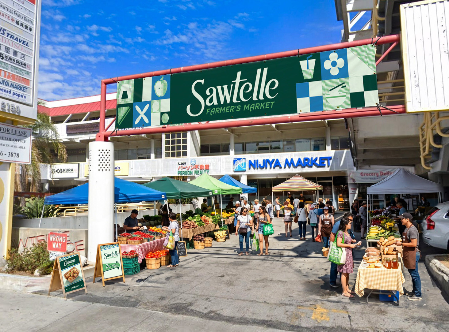
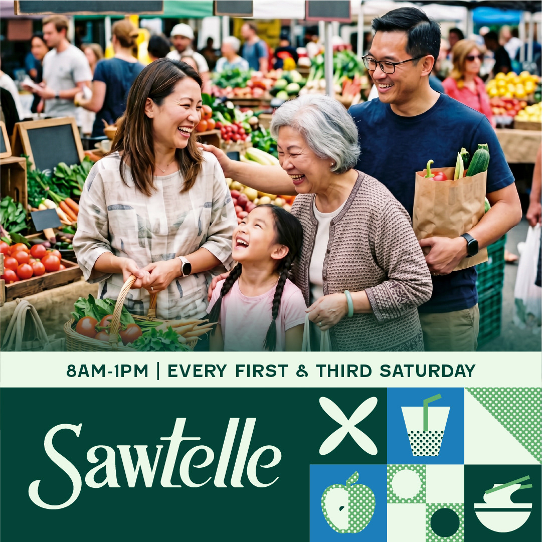
Concept of Sawtelle Farmer's Market, held in the parking lot of Sawtelle Place
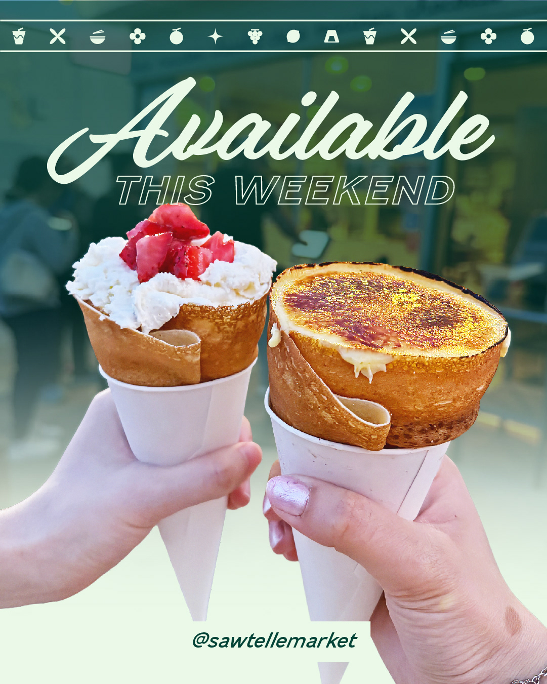
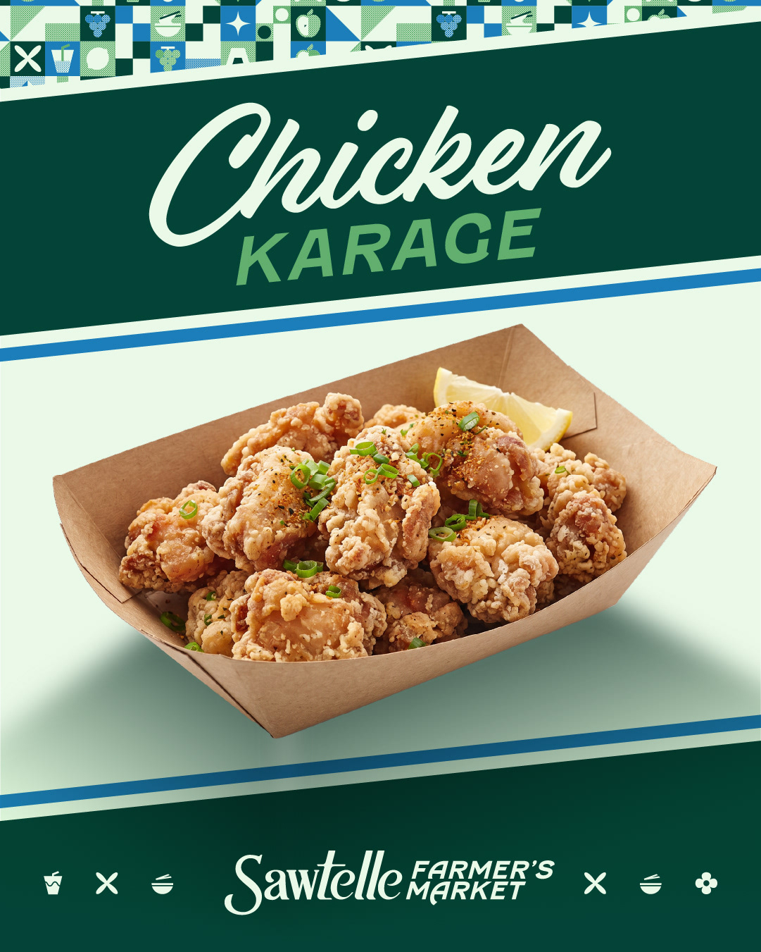
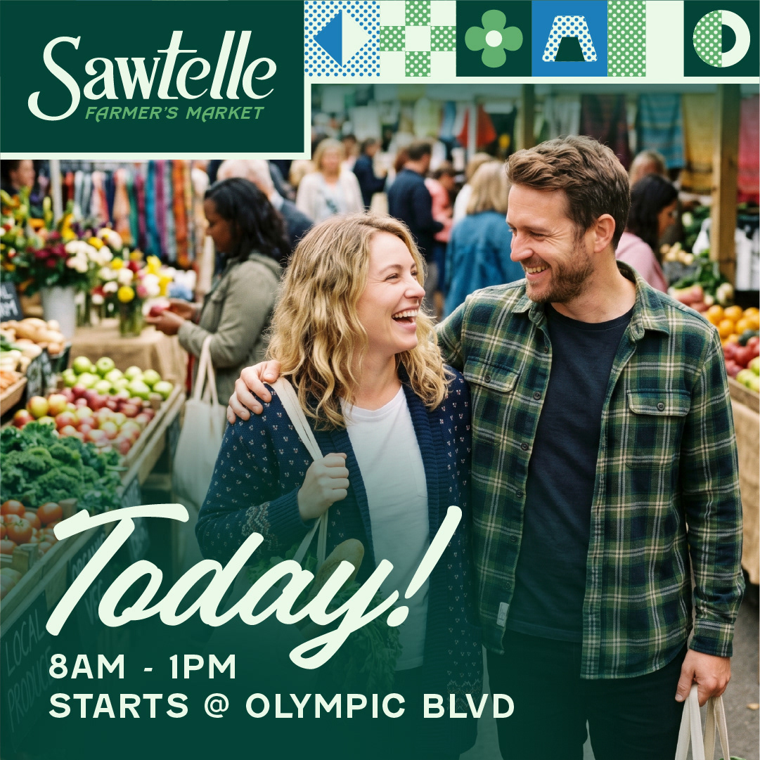
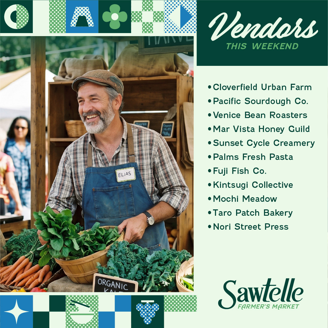
Social Media Graphics for Marketing
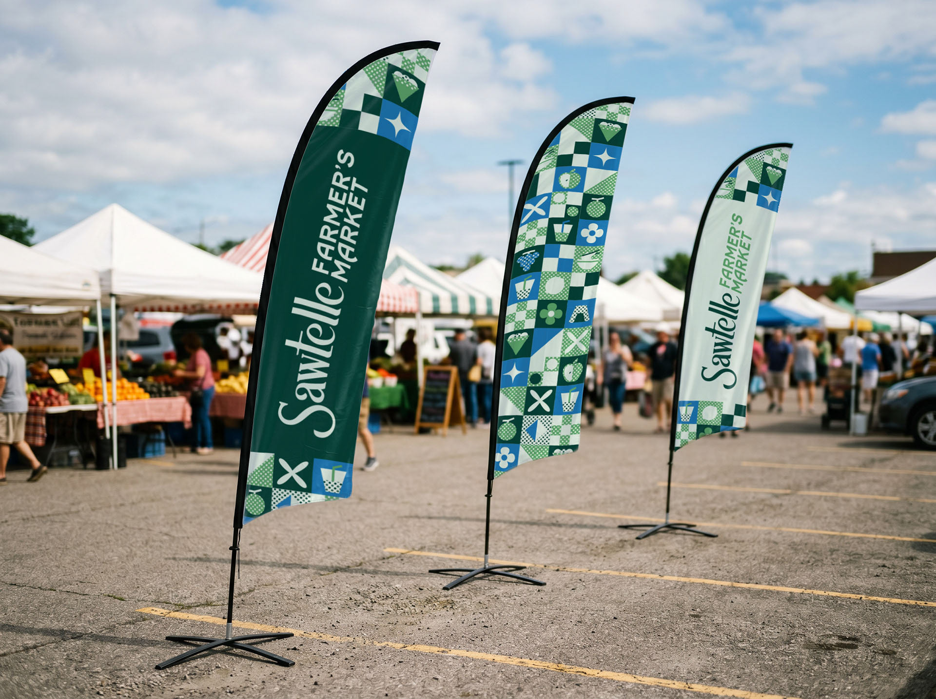
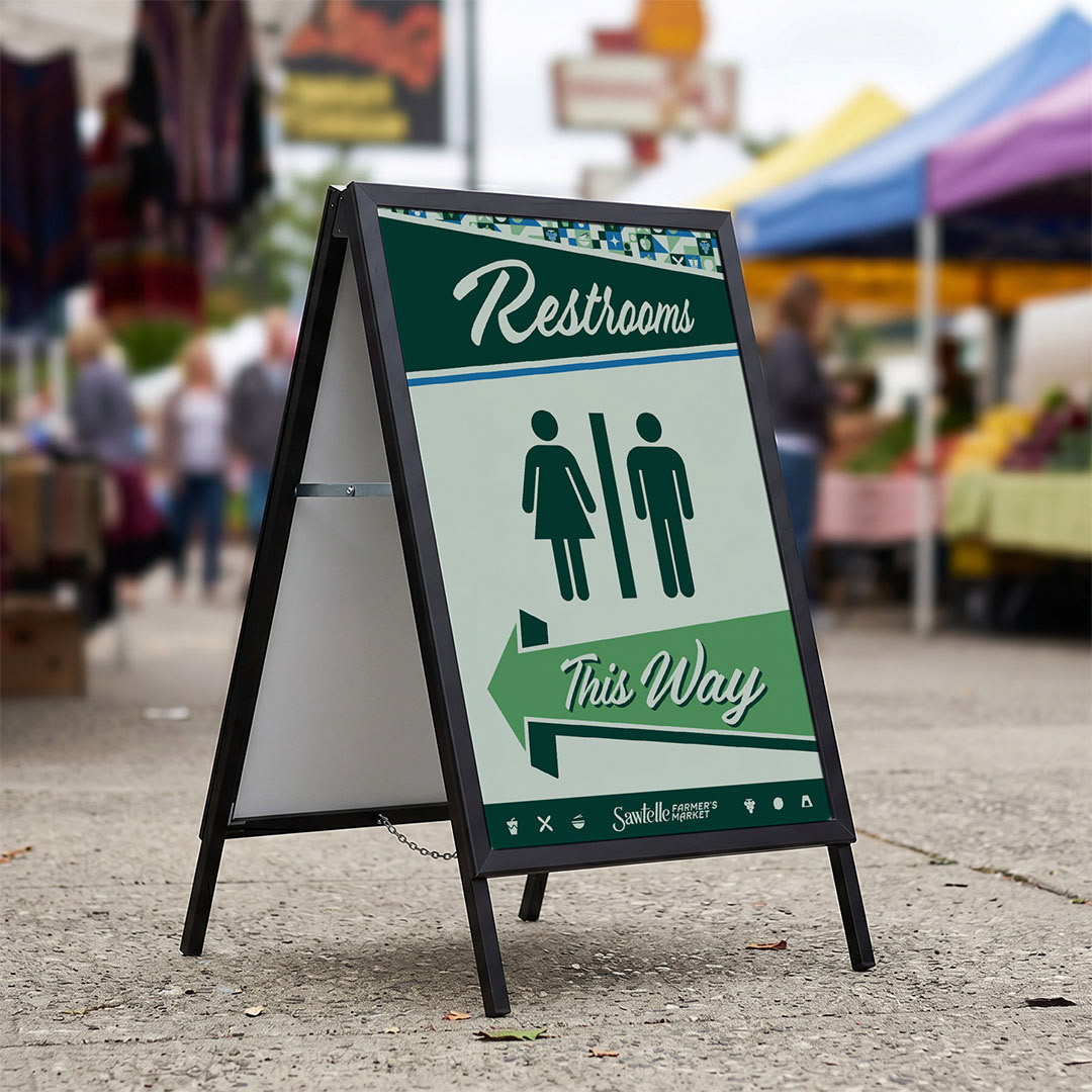
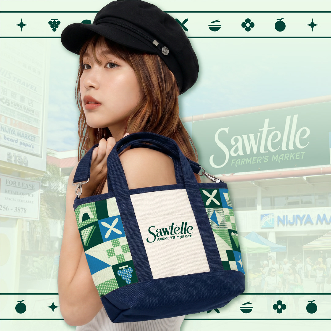
Environmental Design Elements
Behind The Vibes
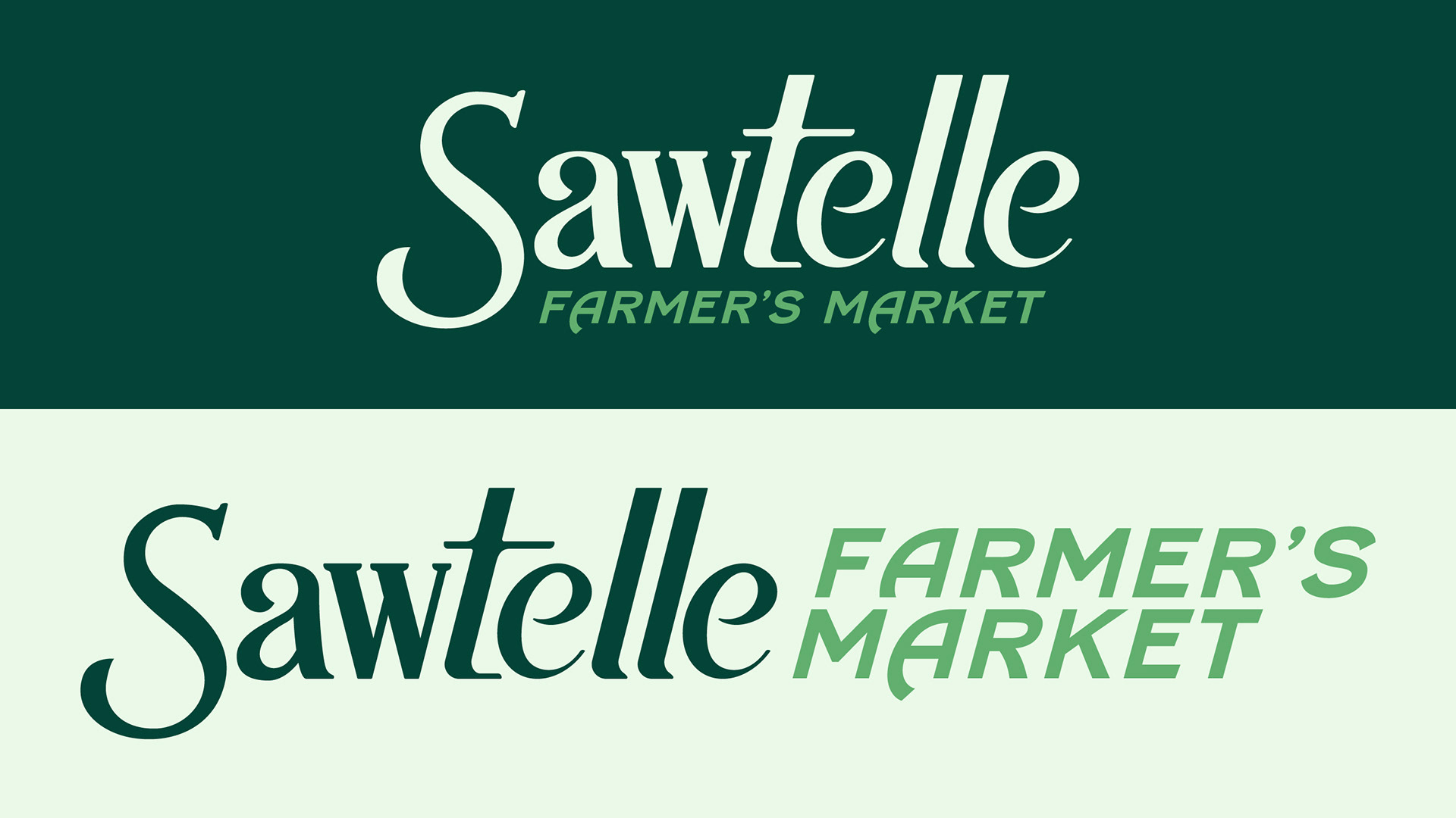
After sketching the logo, I brought the sketch into Illustrator, where I created clean outlines with minimal, but effective, vector points.
Since I want this brand to have a friendly first impression, I iterated on the capital 'S,' eventually opting for a softer serif for a softer look. Lowering the S from the initial sketch and shortening the ascender letters allowed me to efficiently use the negative space for a balanced look.
In the concept process, I initially planned on illustrating a series of food items that are common draws to Sawtelle. Ultimately, I decided against it since the presentation of the food here indeed speaks for itself.